Mr. David Renna

I would like to welcome those who read my blog. As we get a little better at this, things are looking up.

Saturday, July 24, 2010

Week 10: Line of Sight Analysis


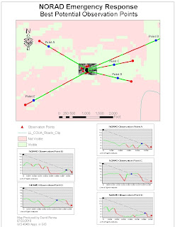
This is week 10 deliverable 3. This was by far the hardest map for me to produce. I had to reproject the necessary data so that the calculations would come out correctly. I probably spent have of the time this week on this map alone. That being said. I believe this would be a good tool in homeland security of critical sites like NORAD.
The map shows 5 observation point which I established along the hillsides surrounding the NORAD tunnel. These 5 sites would be vital in an emergency. We then used the line of sight tool in the 3-d Analyst toolbar to establish areas outside of the image where visual observation would not be possible due to hills and valleys. The tool allows us to interpolate where good sites are for additional observation through camera surveillance. The red in the lines show areas a;ong the line where visibility is obscurred. The blue dots show exactly where 5 new camera surveillance post should be set up to optimize the surveillance of the area in case of an emergency. In addition, the graphs of each of the line of site analysis are included to better understand the position along the line where the new surveillance camera network is to be set up. The graphs illustrate the elevation of the surrounding lands along the line of site and show how visibility would be obstructed. They also give us a good idea as to what areas the new sites will be observing such as hills and valleys.

Week 10: Ingress and Egress Routes


This is week 10: Deliverable 2 The map shows the local roads around the Cheyenne Mountain Heliport. It shows the 500 ft. buffer zone around the heliport. It would be very important to keep this heliport in operation during a homeland security crisis. It could be a vital transport station for high ranking officials in our government. So I believe it is important to show where roadblocks along these routes would have to be set up. The map shows the five locations of police mandated roadblocks that would have to be established to ensure the operation of the heliport. They are located at point where the local roads intersect with the 500 ft buffer zone around the Cheyenne Mountain Heliport.

Week 10: Buffer Zones


This is week10 Deliverable 1 for GIS 4048 Applications in GIS for summer 2010 at UWF online GIS. The map shows the areas around NORAD that are essential in case of a homeland security threat. The critical infrastructure around NORAD are also detailed. There is only one airport within the 3 mile buffer zone(Cheyenne Mountain Heliport). It would be very critical to keep the heliport running in an emergency. The map illustrates the 3 mile buffer zone around NORAD as well as a 500 ft. buffer zone around the Cheyenne Mountain Heliport. I have done an enlay of the larger area so that both buffer zones aree easily displayed on one map.

Thursday, July 8, 2010

Week8: Crime Time Graph


This is Week 8 Deliverable 4. The graph shows an hour by hour breakdown of number of crime occurring during the month of August 2009 for the Washington D.C. area. You can see a spike in activity for the month during the hours between 6 P.M. and just after Midnight. I did not want to add this to my map layout as it was not required and I have had problems with clarity of graphs within my maps in the first 2 assignments this week.

Week3: Burglary, Homicide, and Sex Abuse Crime Density


This is Week 8: Crime Density Map
This map includes 3 distinct maps showing crime density within Washington D.C. The 3 maps show Burglary crime density, Homicide crime density, and Sex Abuse crime density. I have included major highways and interstates to show location within the area. I put Sex Abuse at the top because that is what I would look at if moving to the area. So I thought it was very important. I tried to keep the map as simple as possible because of the number of elements that were already on it.

Week8 Deliverable 2: Multi-ring Buffers


This is Week8: Crime Proximity Map
I took more time on this map than any other this week. I was able to distinguish between types of Police Stations, including District Headquarters, Liason Units, ROC Headquarters, and Substations. I included multi-ring buffers to show crime within .5, 1, and 2 miles of existing police stations. I allowed transparency on the buffers to determine where would be the best areas to place 4 new proposed substations. I produced a new layer from this data called proposed substations and added the points to my map to easily show where I thought the new substations should be built. I included a graph to show the number of crimes within existing stations jurisdiction. Unfortunately, this graph did not come out looking like it did in ArcMap. I don't know why my graphs look bad. I guess from looking at others, I probably needed to make them larger for clarity.

Week8: Washington D.C. Basemap


This is my Basemap for Week 8: Washington D.C. Crime Analysis. I have included the required graph which breaks down area crime by type and gives totals for the month of August 2009. I have also included the major interstates and highways, location of the police stations within Washington, locations of where crimess took place, and census blocks. I tried to get the graph to come in better with no luck. I don't know why it came out so bad.