Mr. David Renna

I would like to welcome those who read my blog. As we get a little better at this, things are looking up.

Wednesday, August 4, 2010

Hurricane Damage to Historical Structures of St. John's County

The history of St. John's County, Fl is vital to all parts of society. The tourism to this area of the First Coast is evidently dependent on the existence of its historically important sites. What would happen to the historical sites of this area if a major hurricane were to make a direct landfall?
This is a vital question to everyone who lives here. Fortunately, St. John's County has not had a direct landfall from any hurricane since 1964 (Dora Cat. 2) and has never seen a major hurricane directly impact the area. We might be overdue. I hope not. This study is to see what would happen to these historic sites if a Category 3,4, or 5 hurricane were to ever strike this area. Lets hope this never occurs.

Final Project: Hurricane Study of Historic Sites of St. John's County


I hope everyone has a great couple weeks off and I am excited to get started on my internship which starts tomorrow and our final class.

Saturday, July 24, 2010

Week 10: Line of Sight Analysis


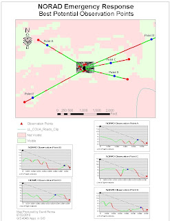
This is week 10 deliverable 3. This was by far the hardest map for me to produce. I had to reproject the necessary data so that the calculations would come out correctly. I probably spent have of the time this week on this map alone. That being said. I believe this would be a good tool in homeland security of critical sites like NORAD.
The map shows 5 observation point which I established along the hillsides surrounding the NORAD tunnel. These 5 sites would be vital in an emergency. We then used the line of sight tool in the 3-d Analyst toolbar to establish areas outside of the image where visual observation would not be possible due to hills and valleys. The tool allows us to interpolate where good sites are for additional observation through camera surveillance. The red in the lines show areas a;ong the line where visibility is obscurred. The blue dots show exactly where 5 new camera surveillance post should be set up to optimize the surveillance of the area in case of an emergency. In addition, the graphs of each of the line of site analysis are included to better understand the position along the line where the new surveillance camera network is to be set up. The graphs illustrate the elevation of the surrounding lands along the line of site and show how visibility would be obstructed. They also give us a good idea as to what areas the new sites will be observing such as hills and valleys.

Week 10: Ingress and Egress Routes


This is week 10: Deliverable 2 The map shows the local roads around the Cheyenne Mountain Heliport. It shows the 500 ft. buffer zone around the heliport. It would be very important to keep this heliport in operation during a homeland security crisis. It could be a vital transport station for high ranking officials in our government. So I believe it is important to show where roadblocks along these routes would have to be set up. The map shows the five locations of police mandated roadblocks that would have to be established to ensure the operation of the heliport. They are located at point where the local roads intersect with the 500 ft buffer zone around the Cheyenne Mountain Heliport.

Week 10: Buffer Zones


This is week10 Deliverable 1 for GIS 4048 Applications in GIS for summer 2010 at UWF online GIS. The map shows the areas around NORAD that are essential in case of a homeland security threat. The critical infrastructure around NORAD are also detailed. There is only one airport within the 3 mile buffer zone(Cheyenne Mountain Heliport). It would be very critical to keep the heliport running in an emergency. The map illustrates the 3 mile buffer zone around NORAD as well as a 500 ft. buffer zone around the Cheyenne Mountain Heliport. I have done an enlay of the larger area so that both buffer zones aree easily displayed on one map.

Thursday, July 8, 2010

Week8: Crime Time Graph


This is Week 8 Deliverable 4. The graph shows an hour by hour breakdown of number of crime occurring during the month of August 2009 for the Washington D.C. area. You can see a spike in activity for the month during the hours between 6 P.M. and just after Midnight. I did not want to add this to my map layout as it was not required and I have had problems with clarity of graphs within my maps in the first 2 assignments this week.

Week3: Burglary, Homicide, and Sex Abuse Crime Density


This is Week 8: Crime Density Map
This map includes 3 distinct maps showing crime density within Washington D.C. The 3 maps show Burglary crime density, Homicide crime density, and Sex Abuse crime density. I have included major highways and interstates to show location within the area. I put Sex Abuse at the top because that is what I would look at if moving to the area. So I thought it was very important. I tried to keep the map as simple as possible because of the number of elements that were already on it.

Week8 Deliverable 2: Multi-ring Buffers


This is Week8: Crime Proximity Map
I took more time on this map than any other this week. I was able to distinguish between types of Police Stations, including District Headquarters, Liason Units, ROC Headquarters, and Substations. I included multi-ring buffers to show crime within .5, 1, and 2 miles of existing police stations. I allowed transparency on the buffers to determine where would be the best areas to place 4 new proposed substations. I produced a new layer from this data called proposed substations and added the points to my map to easily show where I thought the new substations should be built. I included a graph to show the number of crimes within existing stations jurisdiction. Unfortunately, this graph did not come out looking like it did in ArcMap. I don't know why my graphs look bad. I guess from looking at others, I probably needed to make them larger for clarity.

Week8: Washington D.C. Basemap


This is my Basemap for Week 8: Washington D.C. Crime Analysis. I have included the required graph which breaks down area crime by type and gives totals for the month of August 2009. I have also included the major interstates and highways, location of the police stations within Washington, locations of where crimess took place, and census blocks. I tried to get the graph to come in better with no luck. I don't know why it came out so bad.

Wednesday, June 30, 2010

David Renna Apps in GIS: Week 7: St. John's County Home Site Selection

David Renna Apps in GIS: Week 7: St. John's County Home Site Selection

Week 7: St. John's County Home Site Selection


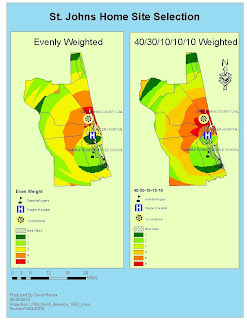
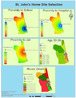
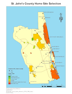
This is my week 7 Deliverable for Home Site Selection in St. John's County, Fl. I had a few problems with licensing on the server 2. I know I'm not the only one. After many hours of checking my Environments and looking through the ESRI website for answers I was able to perform all calculations just like Week 6. The size of the map only became a problem when I had an extra page in my pdf. I thought this was the least of the problems. Had problems linking pdf file to blog.


Thursday, June 17, 2010

Week6: Map Overlays


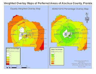
This is Deliverable3 for week 6. The map consist of 2 maps. The one one the left show a equal distribution of the 4 parameters. The second shows a more accurate depiction 40/40/10/10 percentage of what the couple thinks is important in buying a house. I have chosen the same color ramp for this project Green - Red to emphasize the green areas as good. I also adjusted to most desirable areas to clear to highlight them. This gave me a good idea on both maps as to desirable areas and the tract data so I could pick 3 areas in each to have as the top 3 areas.The one area on both is just SW of the hospital and is where I beleive the couple should search.

Week6: 4 Maps Approach to Decision Making


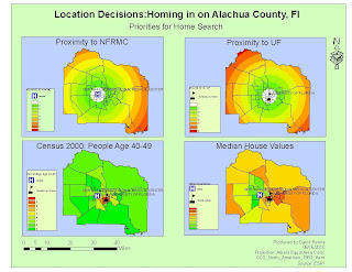
This is Deliverable 2 for week 6 in Applications in GIS. This map is composed of 4 different maps. Each map is associated with a known parameter for the couples decision making process.
The first is proximity to North Florida Regional Medical Center. I used the same color ramp for all my maps. Green to Red. Green being good. I altered the closest proximity for easier visual impact.
The second map is of the proximity to UF. I used the same techniques to highlight the closest region.
The third map is of the percentage of people in each area 40-49 years of age. The couple wanted this to be their third evaluating parameter as they want to be around people their own age.
The fouth map is of mean home values as the couple want to be in a good area with high mean home values.

Week 6 Basemap of Alachua County Florida


This is Deliverable 1 for Week 6 project in Applications in GIS. This is the basemap for Alachua County, Florida. It details the different public land areas and ownership of those areas for the study area.I have included Census 200 tract, places, and roads to get your bearings of Alachua County.

Monday, June 14, 2010

Week 5 : Urban Planning and Impact Assessment


This map shows the various areas and their LQ value which is a value assigned to different industries by the amount of financial gain they provide to the local community through exportation of products. Any 1 and higher are essential businesses due to exporting of goods.

Week 5 : Urban Planning and Impact Assessment


This shows the student occupancy rates for the living areas around Pewter University. I describes the amount of students living within each building area. The map also divides the areas into percentage of students to total populated for each area.

Week 5 : Urban Planning and Impact Assessment


In this map we are assessing what sort of impact the new building being proposed is going to have on the road that its is located on. You can see that the area closest to the proposed site(Local Area) is impacted much more than any other area on the street.

Sunday, June 13, 2010

Participation 2-4: GIS Role in Oil Spill

GIS plays a vital role in disaster response. It can be used to assist in the efforts of first responders, Environmental and Federal Agencies, National Wildlife and Fishing Agencies, and in the efforts of local business to be prepared for natural disasters.

With respect to the Deepwater Horizon Oil Spill, GIS has been used by first responders to track the extent of the oil and its movement. GIS has played a key role in the efforts of first responders. It has done a great job in showing areas of concern for people on ground zero. Maps have been made to show the flow of the oil with respect to landfall.

Environmental and Federal Agencies have used GIS to produce ESI index maps of the various species and conservation areas that are going to be effected by the oil spill. National Fishing Agencies have used GIS to map out the oil spill in order to close boundaries for fishing both in offshore and inland waters.

Finally, local governments and businesses are using GIS to access the economic impact that this catastrophe is having on the region. GIS might not be the cure for a natural disaster like the Deepwater Horizon Oil Spill, but it sure has played a vital role in the initial efforts in the area to make decisions based on the latest data available.
Wednesday, June 9, 2010

Horizon Oilspill: Booming Operations


This is my map for the booming operations in the Fort Walton Beach Area. I have divided the operations into five categories. I have also included a chart to show the types of operation, how many booms in each, and the length in feet of the booms.

Horizon Oilspill: ESI Species Areas of Concern


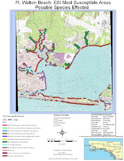
On my second map, I have detailed the areas where susceptible habitat and species are located. I used the guidelines for Alabama from the readings to use appropriate horizontal hatched colors to represent each types of species and the areas where they are known to survive or have been spotted in the last year as per Alabama guidelines. I found that I could not represent each species as a symbol. So this is how I did it. I also included a chart with identifyable species of each type on the map.I also included my Socecon point data to show that there are 26 points. 21 marinas, 4 beaches, and 1 airport.

Horizon Oilspill: ESI Areas of Concern/Management Areas


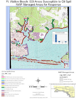
I chose the area around Fort Walton Beach. It is actually tile 17 in the South shoreline and bay area of Oskaloosa County, FL.This is the first of 3 maps. I have highlighted the ESI Areas of greatest susceptibility to oil. I tried to use appropriate colors for the areas. I also have included Management Areas for easier access to Fedeeral and State help.